
When people think of “data science” they probably think of algorithms that scan large datasets to predict a customer’s next move or interpret unstructured text. But what about models that utilize small, time-stamped datasets to forecast dry metrics such as demand and sales? Yes, I’m talking about good old time series analysis, an ancient discipline that hasn’t received the cool “data science” rebranding enjoyed by many other areas of analytics.
Yet, analysis of time series data presents some of the most difficult analytical challenges: you typically have the least amount of data to work with, while needing to inform some of the most important decisions. For example, time series analysis is frequently used to do demand forecasting for corporate planning, which requires an understanding of seasonality and trend, as well as quantifying the impact of known business drivers. But herein lies the problem: you rarely have sufficient historical data to estimate these components with good precision. And, to make matters worse, validation is more difficult for time series models than it is for classifiers and your audience may not be comfortable with the embedded uncertainty.
So, how does one navigate such treacherous waters? You need business acumen, luck, and Bayesian structural time series models. In my opinion, these models are more transparent than ARIMA – which still tends to be the go-to method. They also facilitate better handling of uncertainty, a key feature when planning for the future. In this post I will provide a gentle intro the bsts R package written by Steven L. Scott at Google. Note that the bsts package is also being used by the CausalImpact package written by Kay Brodersen, which I discussed in this post from January.
First, let’s start by fitting a classical ARIMA (autoregressive integrated moving average) model to the famous airline passenger dataset. The ARIMA model has the following characteristics:
) and a moving average term (q=1
library(lubridate)
library(bsts)
library(dplyr)
library(ggplot2)
library(forecast)


### Load the data
data("AirPassengers")
Y <- window(AirPassengers, start=c(1949, 1), end=c(1959,12))

### Fit the ARIMA model
arima <- arima(log10(Y),
               order=c(0, 1, 1),
               seasonal=list(order=c(0,1,1), period=12))

### Actual versus predicted
d1 <- data.frame(c(10^as.numeric(fitted(arima)), # fitted and predicted
                   10^as.numeric(predict(arima, n.ahead = 12)$pred)),
                   as.numeric(AirPassengers), #actual values
                   as.Date(time(AirPassengers)))
names(d1) <- c("Fitted", "Actual", "Date")


### MAPE (mean absolute percentage error)
MAPE <- filter(d1, year(Date)>1959) %>% summarise(MAPE=mean(abs(Actual-Fitted)/Actual))

### Plot actual versus predicted
ggplot(data=d1, aes(x=Date)) +
  geom_line(aes(y=Actual, colour = "Actual"), size=1.2) +
  geom_line(aes(y=Fitted, colour = "Fitted"), size=1.2, linetype=2) +
  theme_bw() + theme(legend.title = element_blank()) +
  ylab("") + xlab("") +
  geom_vline(xintercept=as.numeric(as.Date("1959-12-01")), linetype=2) +
  ggtitle(paste0("ARIMA -- Holdout MAPE = ", round(100*MAPE,2), "%")) +
  theme(axis.text.x=element_text(angle = -90, hjust = 0))
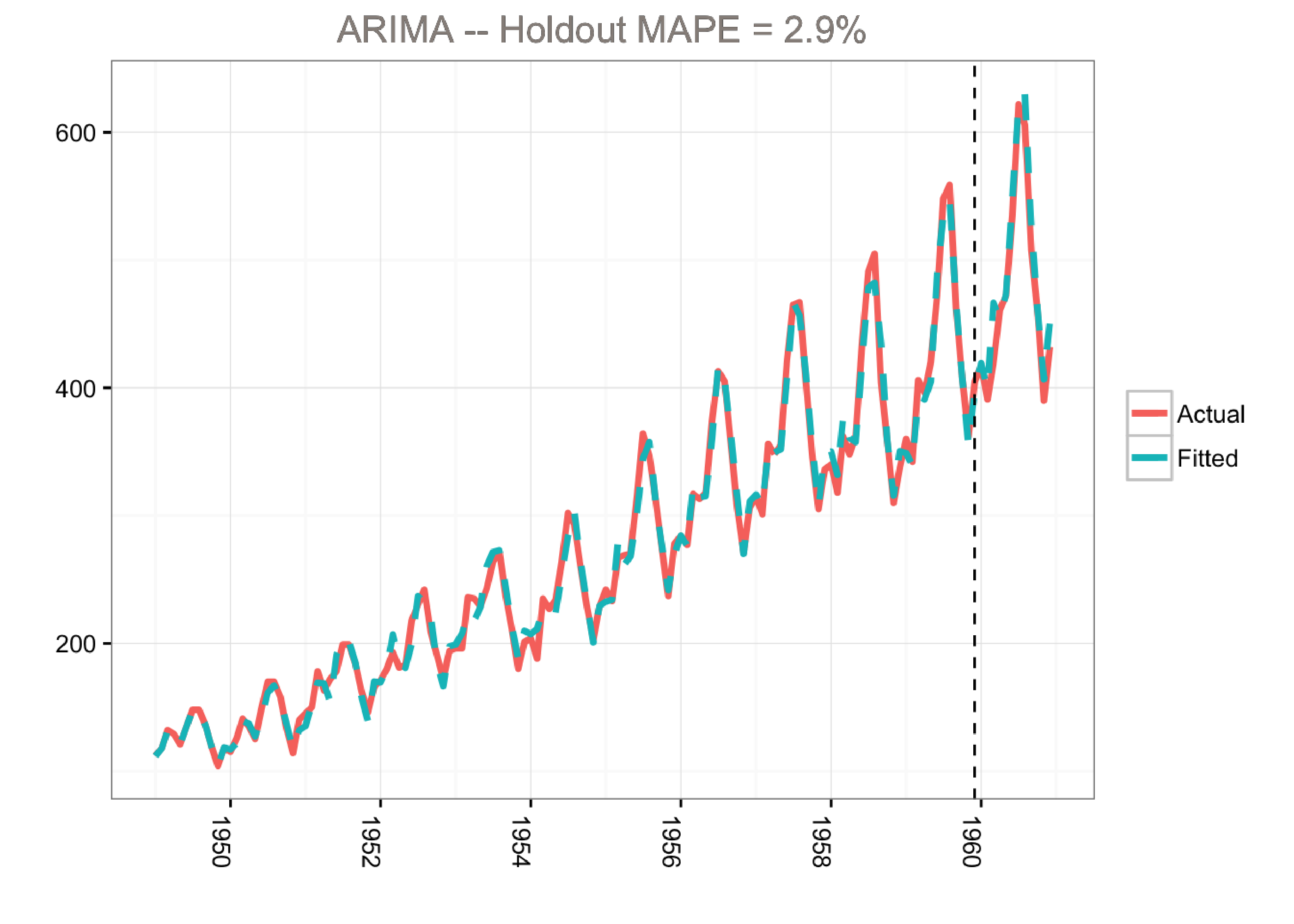
This model predicts the holdout period quite well as measured by the MAPE (mean absolute percentage error). However, the model does not tell us much about the time series itself. In other words, we cannot visualize the “story” of the model. All we know is that we can fit the data well using a combination of moving averages and lagged terms.
A different approach would be to use a Bayesian structural time series model with unobserved components. This technique is more transparent than ARIMA models and deals with uncertainty in a more elegant manner. It is more transparent because its representation does not rely on differencing, lags and moving averages. You can visually inspect the underlying components of the model. It handles uncertainty in a better way because you can quantify the posterior uncertainty of the individual components, control the variance of the components, and impose prior beliefs on the model. Last, but not least, any ARIMA model can be recast as a structural model.
Generally, we can write a Bayesian structural model like this:
Here xt
denotes a set of regressors, St represents seasonality, and μt is the local level term. The local level term defines how the latent state evolves over time and is often referred to as the unobserved trend. This could, for example, represent an underlying growth in the brand value of a company or external factors that are hard to pinpoint, but it can also soak up short term fluctuations that should be controlled for with explicit terms. Note that the regressor coefficients, seasonality and trend are estimated simultaneously, which helps avoid strange coefficient estimates due to spurious relationships (similar in spirit to Granger causality, see 1). In addition, due to the Bayesian nature of the model, we can shrink the elements of β
to promote sparsity or specify outside priors for the means in case we’re not able to get meaningful estimates from the historical data (more on this later).
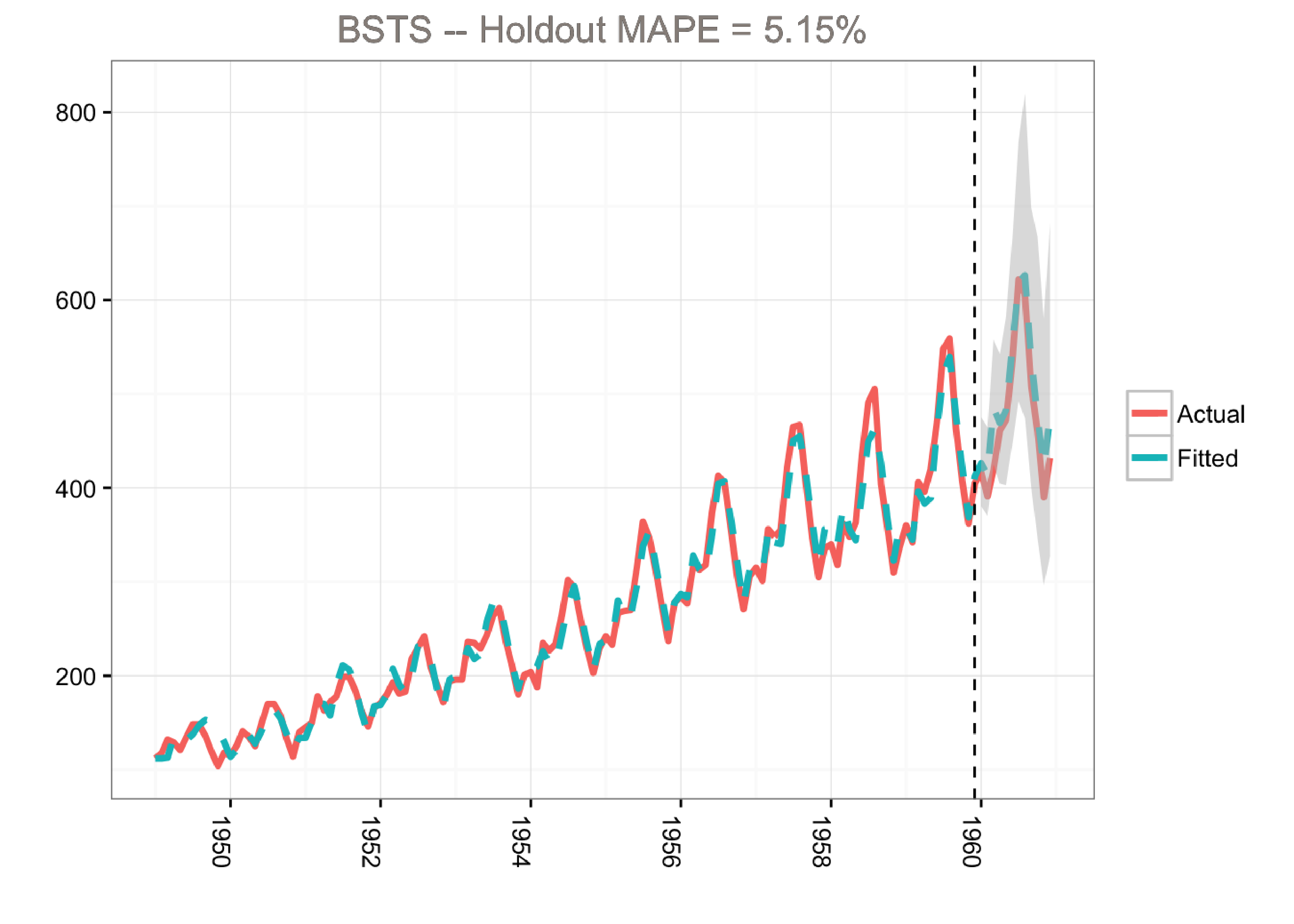
The airline passenger dataset does not have any regressors, and so we’ll fit a simple Bayesian structural model:
library(lubridate)
library(bsts)
library(dplyr)
library(ggplot2)

### Load the data
data("AirPassengers")
Y <- window(AirPassengers, start=c(1949, 1), end=c(1959,12))
y <- log10(Y)


### Run the bsts model
ss <- AddLocalLinearTrend(list(), y)
ss <- AddSeasonal(ss, y, nseasons = 12)
bsts.model <- bsts(y, state.specification = ss, niter = 500, ping=0, seed=2016)

### Get a suggested number of burn-ins
burn <- SuggestBurn(0.1, bsts.model)

### Predict
p <- predict.bsts(bsts.model, horizon = 12, burn = burn, quantiles = c(.025, .975))

### Actual versus predicted
d2 <- data.frame(
    # fitted values and predictions
    c(10^as.numeric(-colMeans(bsts.model$one.step.prediction.errors[-(1:burn),])+y),
    10^as.numeric(p$mean)),
    # actual data and dates
    as.numeric(AirPassengers),
    as.Date(time(AirPassengers)))
names(d2) <- c("Fitted", "Actual", "Date")

### MAPE (mean absolute percentage error)
MAPE <- filter(d2, year(Date)>1959) %>% summarise(MAPE=mean(abs(Actual-Fitted)/Actual))

### 95% forecast credible interval
posterior.interval <- cbind.data.frame(
  10^as.numeric(p$interval[1,]),
  10^as.numeric(p$interval[2,]),
  subset(d2, year(Date)>1959)$Date)
names(posterior.interval) <- c("LL", "UL", "Date")

### Join intervals to the forecast
d3 <- left_join(d2, posterior.interval, by="Date")

### Plot actual versus predicted with credible intervals for the holdout period
ggplot(data=d3, aes(x=Date)) +
  geom_line(aes(y=Actual, colour = "Actual"), size=1.2) +
  geom_line(aes(y=Fitted, colour = "Fitted"), size=1.2, linetype=2) +
  theme_bw() + theme(legend.title = element_blank()) + ylab("") + xlab("") +
  geom_vline(xintercept=as.numeric(as.Date("1959-12-01")), linetype=2) +
  geom_ribbon(aes(ymin=LL, ymax=UL), fill="grey", alpha=0.5) +
  ggtitle(paste0("BSTS -- Holdout MAPE = ", round(100*MAPE,2), "%")) +
  theme(axis.text.x=element_text(angle = -90, hjust = 0))
bsts Examples in this Postbsts package returns results (e.g., forecasts and components) as matrices or arrays where the first dimension holds the MCMC iterations.colMeans function). But it’s very easy to get distributions from the MCMC draws, and this is recommended in real life to better quantify uncertainty.ggplot for this example in order to demonstrate how to retrieve the output for custom plotting. Alternatively, we can simply use the plot.bsts function that comes with the bsts package.Note that the predict.bsts function automatically supplies the upper and lower limits for a credible interval (95% in our case). We can also access the distribution for all MCMC draws by grabbing the distribution matrix (instead of interval). Each row in this matrix is one MCMC draw. Here’s an example of how to calculate percentiles from the posterior distribution:
credible.interval <- cbind.data.frame(
  10^as.numeric(apply(p$distribution, 2,function(f){quantile(f,0.75)})),
  10^as.numeric(apply(p$distribution, 2,function(f){median(f)})),
  10^as.numeric(apply(p$distribution, 2,function(f){quantile(f,0.25)})),
  subset(d3, year(Date)>1959)$Date)
names(credible.interval) <- c("p75", "Median", "p25", "Date")
Although the holdout MAPE (mean absolute percentage error) is larger than the ARIMA model for this specific dataset (and default settings), the bsts model does a great job of capturing the growth and seasonality of the air passengers time series. Moreover, one of the big advantages of the Bayesian structural model is that we can visualize the underlying components.
Kim Larsen, Director of Client Algorithms, Stitch Fix
Originally published at http://multithreaded.stitchfix.com
 Kim Larsen is the Director of Client Algorithms at Stitch Fix in San Francisco. Kim has experience working in the software and consulting industries, as well as e-commerce and financial services. Throughout his career, he has managed a wide array of data mining and analytical problems including price optimization, media mix optimization, demand forecasting, customer segmentation, and predictive modeling. Kim frequently speaks at data mining conferences around the world in the areas of segmentation and predictive modeling. His main areas of research include additive non-linear modeling and net lift models (incremental lift models).
You must be logged in to post a comment.


Good and interesting article Kim! The metrics we look at sometimes might not approximately follow a normal distribution (e.g poisson). Do you know whether there is an easy way to customise the distribution when using the bsts package or we have to use other MCMC packages for this sort of customisation?